
Page Design
Admittedly, I'm not the best designer. I contribute quite a bit to Cedar Post design by way of conceptualizing designs, but when it comes to actually realizing my ideas, I'm not the strongest on staff. Even though Adobe Illustrator makes me break out in nervous sweats, I have improved my design skills over time and gained confidence. Below are some of my page designs from the past few years that exemplify my growth.
|
This is the page I designed for the 2016 September Edition. It was my first spread, and is rather simple in structure. The page only had one original photo, and that photo was of my feet. Having a selfie for a main element photo was, in retrospect, not the most interesting way to present the feature story visually. |
|
This is my page from the 2017 January Edition. I was beginning to improve my eye for hierarchy and getting more creative with the way I incorporated elements. This layout is a bit text-heavy, but is overall much stronger than my first. |
|
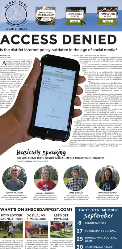
Fast forward to the First Day Edition that I put together in August 2017. I was very proud to have brainstormed, photographed, written and designed this cover independently. I wanted the first Cedar Post of the year to demand attention by grabbing the reader's eye, so I incorporated text wrap around a large cutout. Of course, it's not without shortcomings — my columns on the story didn't really comply well with our grid, for example — but it was free of some of the glaring errors my previous layouts had. This cover was strikingly different than the Cedar Post covers of recent years, and I feel pleased with the tone it set for this year.
|
|
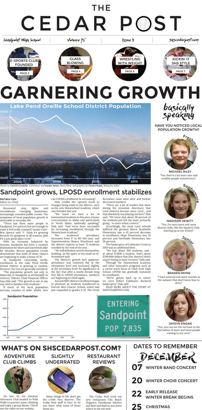
The cover story of the November Edition was a bit dry by the standards of most high school readers — it recounted local population fluctuation and explained the district's free fall in enrollment. When I set out to design the page, I wanted to make it as visually stimulating and engaging as possible. I opted for graphs of district and community populations to tell the story at a glance, and had Design Editor Cienna overlay a graph over a drone photo of Sandpoint. This layout of this page was admittedly a bit textbook, but I was satisfied with the way the visual elements turned out.
|
